PTV happens to be Pakistan’s oldest news channel stream and people have a lot of memories attached to it. Back in the day when the responsibilities of news channels was only to report a particular news and not create any Star-Plus type-ish drama out of politics and report the most useless news, PTV was the one to count on.
Not to forget when PTV showed the best of our drama industry:
The only thing I miss most about the 90’s are those PTV dramas <3
— U. (@KiaaaaaHai) August 31, 2016
[adinserter block=”10″]
As news channels keep innovating themselves and raise their bar, PTV was missing the element it needed the most – coming up with something new. Just when we thought PTV finally did something to attract new viewership or perhaps the old lovers, it is safe to say they didn’t quite get it right.
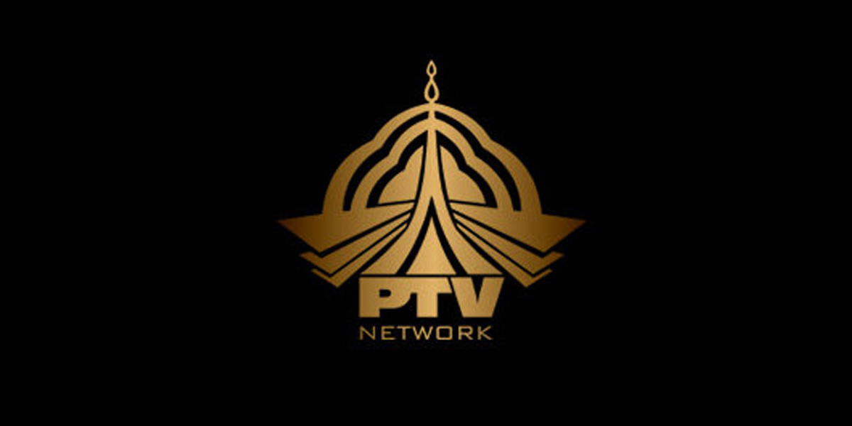
PTV released new logos for its eight channels few days and we cannot ignore how the logos resemble the 2000s Microsoft Internet Explorer icon. It took a while for us to realize this.

Twitter: @AnthonyPermal
It definitely looks like the designer of the logo was as lazy as the reporters of PTV back in the mid 2000s when PTV started losing its touch. We are not the only ones who believe this, btw:
Just when you hope there will be something new:
Congratulations on the launch of your new logo, PTV. Innovative, never seen before stuff. Except… pic.twitter.com/tflCbKCkp5
— Anthony Permal (@anthonypermal) September 6, 2016
Accurately:
Full marks for laziness for designer of this lame PTV Sports logo #PakvsEng pic.twitter.com/UkiF3VM728
— Rizwan (@Rizwvan) August 30, 2016
[adinserter block=”3″]
90s, maybe?
Congratulations PTV, youve just entered bronze age…. https://t.co/tldVfY7cuH
— JAZBATI JHAARU (@JazbatiJhaaru) September 6, 2016
Ouch
PTV Sports New Logo is so Old Fashioned Just like Pakistan Cricket Team #NewLogo #NoCreativity
— Mahwish Solanki (@mahwishSulanki) August 30, 2016
Could Be Done
Such a poor logo of Ptv sports. World moves towards Mars & & Ptv still potray their past 20 year logo.
— Aleem Tayyab (@aleemtayyab91) August 30, 2016